This UI portfolio showcases the work done in designing a subscription system for a media product launch. The product is offered on both mobile-web and mobile app platforms and the goal of the subscription system was to monetize the product through premium (paid) services. The portfolio demonstrates the user interface designs and workflows that were created to facilitate the transition from the free product to the paid subscription.

Process

Research
Ideation
Concept Testing
Design
Testing Design
Reflection


Tools

Figma
Miro
PowerPoint


Project Duration

4 Weeks

Challenges

A startup company launched a media product two years ago with a freemium model. The product is offered with a mobile-web experience and a mobile app for both iOS and Android. The initial business strategy was to attract users by offering a free product, and then offer more features and services to monetize through a premium (paid) product. The product has been well-received and has a healthy user base, but the company now needs to design an experience to allow users to subscribe and pay a monthly fee.


My Role

My role as a designer is to create an intuitive, user-friendly UI and an onboarding experience tailored to users' needs and preferences to convince them to convert from free to paid users. Emphasizing the product's features and benefits, I will design a seamless transition from free to paid, considering the user's journey. My goal is to provide a smooth transition and an experience tailored to their needs.


Solution

My solution for this UI/UX case study involves several steps:

  1. user research to gain insight into user needs and motivations;
  2. an intuitive and easy-to-use interface;
  3. an attractive pricing structure including discounts;
  4. a secure and reliable payment system;
  5. responsive customer support.

This will encourage users to subscribe and have a positive experience with the product.


To create a successful media product subscription experience, we need to learn from the best. By studying how YouTube, Spotify, and Amazon Music have designed their subscription models, we can identify what makes them successful and avoid potential pitfalls in our own design.


I used user interviews to understand the following aspects about the user experience and their motivations:

  1. To understand the user's needs, motivations, and behaviors.
  2. To understand existing signup and sign-in flows to identify any areas of improvement.
  3. To understand the user's experience with the existing freemium and premium models of popular media platforms.

I have covered the outcome of these user interviews in the Synthesis section.


By interviewing users, I identified the target audience and collected data. This data was then used to create a user persona, as shown below...


user persona
Click the image to expand

Empathy map generated during the synthesis process.

user persona
Click the image to expand


As a user, I want to

Image


By creating three user journey maps, I was able to gain insights into the user experience and make informed decisions about design changes.

user persona

user persona

user persona


I developed two versions of usability test scripts and tested them on low fidelity and high fidelity designs respectively. After gathering feedback from the users, I created a high fidelity design and conducted usability tests with a different set of users.

Image Title

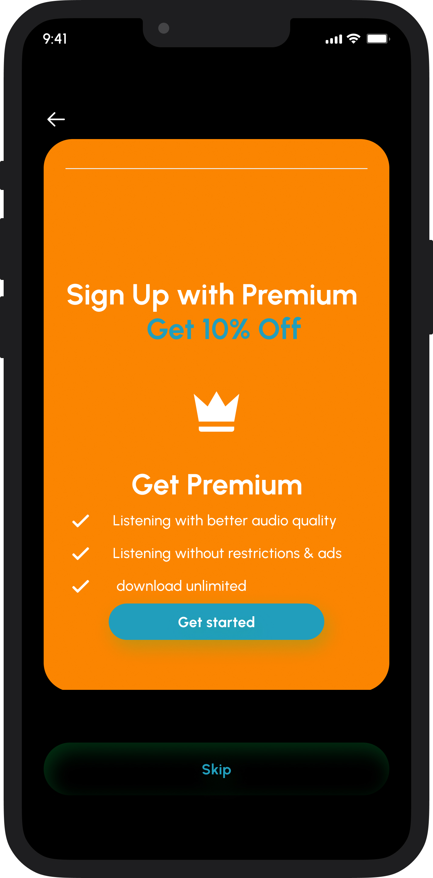
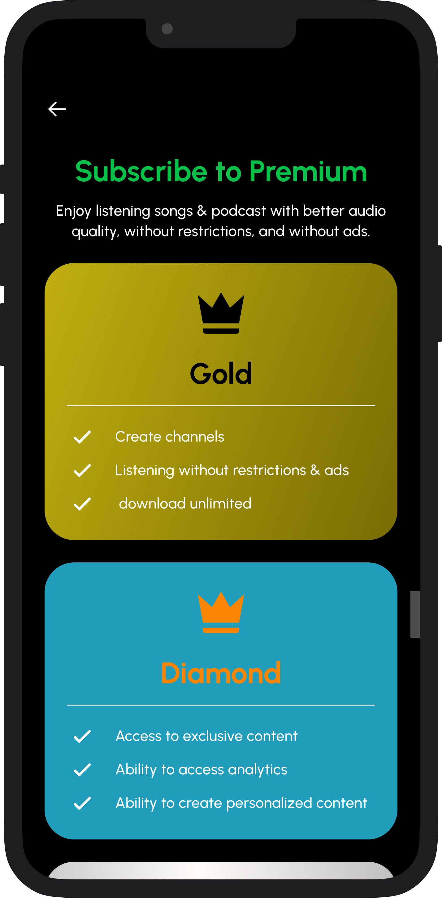
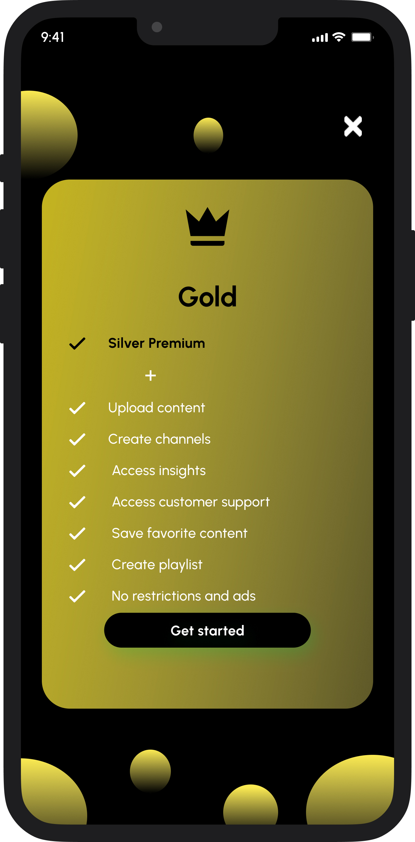
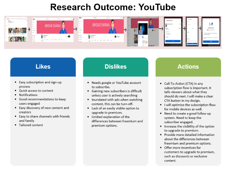
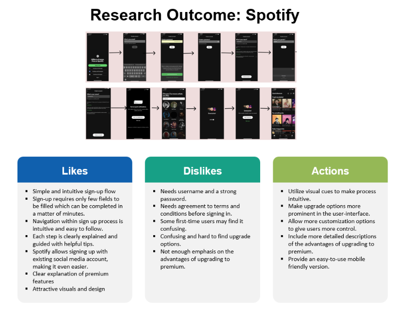
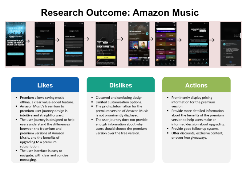
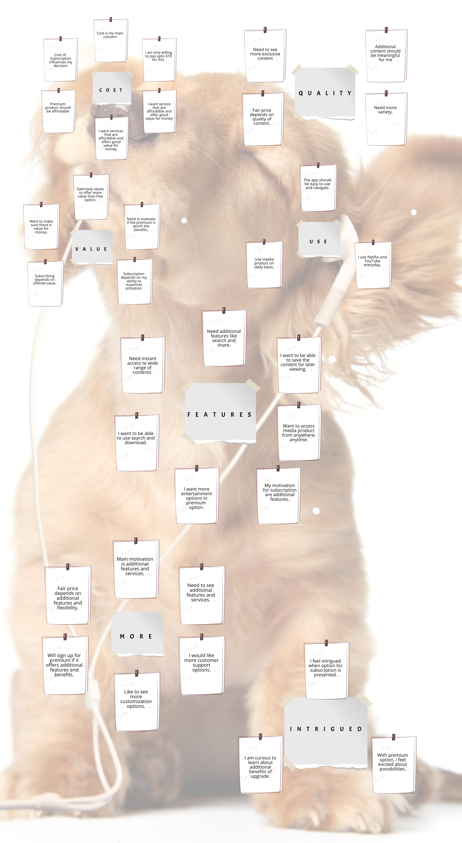
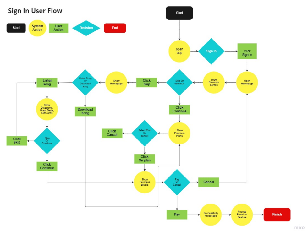
Usability Test Outcome for Low Fidelity Design

The usability testing revealed that while the product has a modern and visually appealing design, there are numerous areas that need improvement. Recommendations include clarifying the sign-up and subscription process, adding features to help users compare subscription tiers and manage their account, and improving the home and profile pages.

Image Title

Usability Test Outcome for High Fidelity Design

This usability test report evaluates various aspects of a media product's UI/UX design. Overall, the product performed well in terms of user-friendly navigation, subscription and payment processes, and a vibrant design. However, the report also identifies areas for improvement, such as the ability to manage existing subscriptions and the lack of specific pages that users may expect, such as a FAQ or feedback page.

I have reflected on this UI/UX project through the three-pronged approach of analyzing the strengths of the design, reflecting on the project and learning from it, and proposing future improvements.